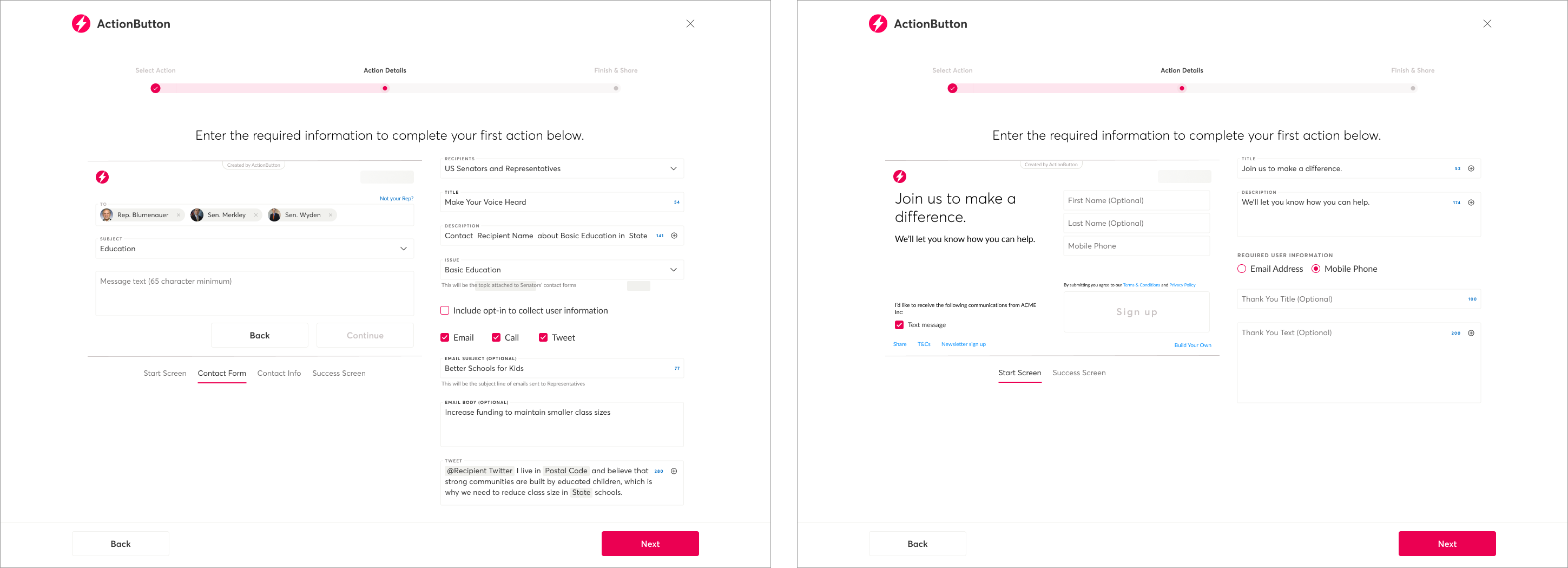
ActionButton is an advocacy tool for customers who want to drive their supporters to take action, including emailing their lawmakers, signing petitions, and sharing their opinions. Shortly after NationBuilder acquired ActionButton, several members of the original team, including the designer, left. With an aggressive product roadmap already in place and a new team, we’ve needed to move quickly without institutional knowledge, a design system, or clear priorities.
By taking on design leadership as well as responsibility for writing requirements for many of our new features, I’ve been able to continue designing for a new customer base while building a design system from scratch. One of my first tasks was designing the user journey for customers to connect their ActionButton and NationBuilder accounts. This was necessary to unlock the value we hoped to gain from acquiring ActionButton.
Once we built the integration between NationBuilder and ActionButton, I designed multiple features to enable customers to create buttons which could take advantage of the ActionButton API to gain more insight into their supporters.

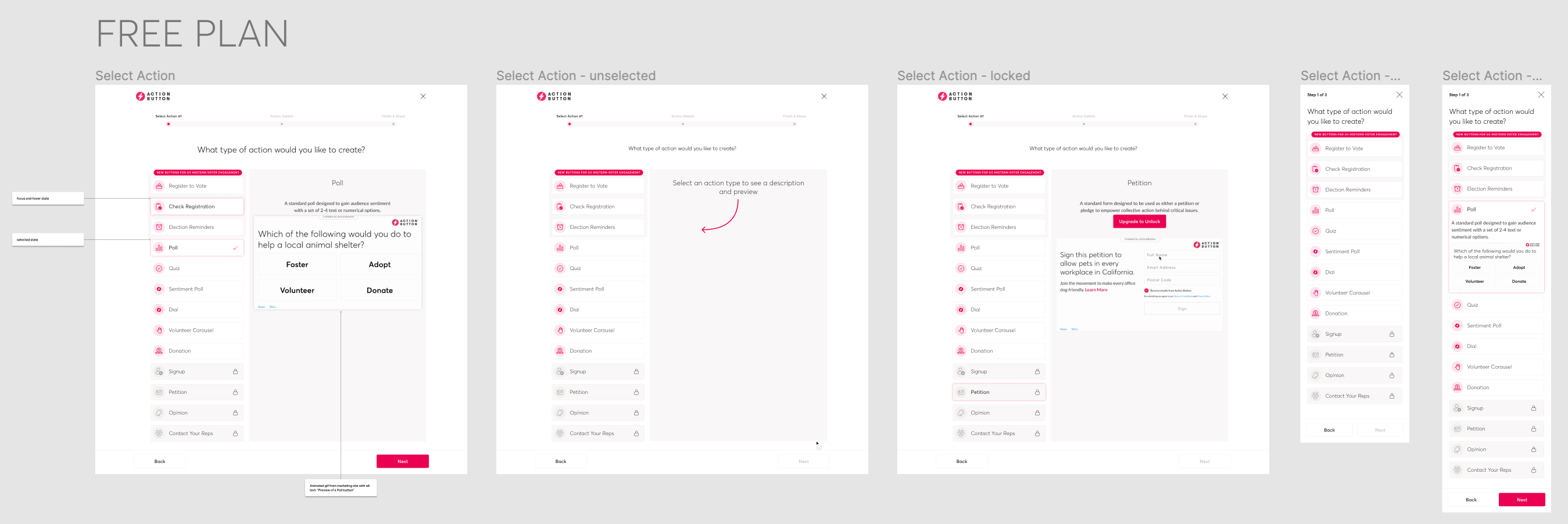
As we’ve added new features to ActionButton, the UI for selecting the type of button you want to create has become unwieldy, and user testing revealed that users didn’t notice button types below the fold. Since we don’t currently have sufficient metrics to justify removing underused or underperforming button types, I took the initiative to redesign this page in order to ensure we could highlight relevant features and leverage existing marketing assets.

We’re continuing to add new customers and upsell existing customers with the new ActionButton features. By building and evolving our design system in Figma and using Storybook to ensure components match, I’ve improved consistency within ActionButton and helped the marketing team update assets.